
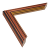
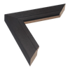
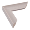
 Artistic
 Beaded
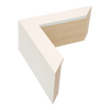
 Box
Box
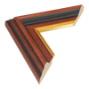
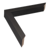
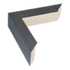
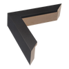
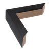
 Chunky
 Colourful
 Contemporary
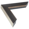
 Deep
Deep
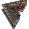
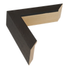
 Distressed
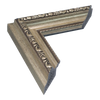
 Elegant
 Luxurious
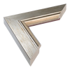
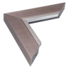
 Metallic
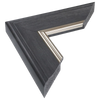
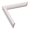
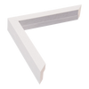
 Minimalist
 Modern
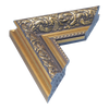
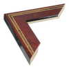
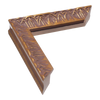
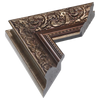
 Ornate
 Rustic
 Scandinavian
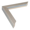
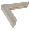
 Thin
Thin
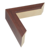
 Traditional
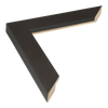
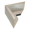
 Weathered
 Wide
Wide
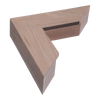
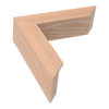
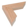
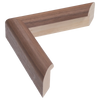
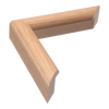
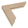
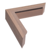
 Wooden
 Allure
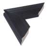
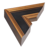
 Angle I
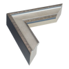
 Angle II
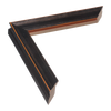
 Baroque I
 Baroque II
 Baroque III
 Beach House I
 Beach House II
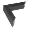
 Box
Box
 Canvas Float I
 Canvas Float II
 Canvas stretcher bars
 Chateau
 Chroma
 Classic I
 Classic II
 Classic III
 Cube
Cube
 Cushion
 Diploma
 Echo
Echo
 EcoEmpire
 Edge
Edge
 Elegance
 Empire I
 Empire II
 Empire III
 Florenza
 Flow I
 Flow II
 Flux
Flux
 Gelato
 Geo
Geo
 Grace
Grace
 Groove I
 Groove II
 Heirloom
 Hermitage
 Hockey I
 Hockey II
 Inset
Inset
 Intra
Intra
 Lacquer
 Laurel
 Legacy
 Linear I
 Linear II
 Lined
Lined
 Majestic
 Metro
Metro
 Milano
 Monarch
 Mosaic
 Muse I
 Muse II
 Nero
Nero
 Nimbus
 Nordic
 Palazzo
 Portico
 Prima
Prima
 Pure
Pure
 Regency
 Ripple
 Scoop
Scoop
 Solid Box
 Spacer I
 Spacer II
 Step
Step
 Strata
 Swoop
Swoop
 Tivoli
 Tribeca
 Waldorf
 Beaded
 Brushed
 Chrome
 Distressed
 Gilded
 Gloss
Gloss
 Grain
Grain
 Matt
Matt
 Metallic
 Mirrored
 Ornate
 Painted
 Smoked
 Smooth
 Stained
 Veneered
 Washed
 Wood
Wood
Interior design & styling
FAQs
Yes, we do! Choosing the right frame can be challenging, so our experienced team is here to help. We offer free consultations to assist with selecting the perfect style, size, mount colour or layout for your artwork, whether it's for a single piece or a gallery wall. For larger projects or contract clients, we’ll work closely with you to meet specific design requirements and ensure the perfect framing solution. For more information, get in touch.
Our most popular frame colours are black, white and oak (natural wood). Black and white frames are timeless and versatile – black frames provide a bold contrast, while white frames lend a clean, subtle aesthetic to artwork. Oak (and other natural wood tones) is highly sought after for its warmth and classic appeal, making it a great fit for many interior styles.
Among metallics, silver and gold are top choices, adding elegance and sophistication, especially for diplomas, mirrors and traditional artwork. Other trending colours include grey tones, bronze and distressed whites. However, if you’re unsure, you can't go wrong with black, white or natural wood – they’re always stylish and adaptable.
To see our full range of bestselling frames, check out our bestsellers collection.
Choosing the right frame can feel tricky, but a few guidelines can help simplify the process:
Consider the artwork
The frame should complement the artwork – not overpower it. Pay attention to the dominant colours and style. For example, black or white frames are versatile and put the focus on the artwork, while a natural wood frame adds warmth. Formal art (like oil paintings or diplomas) often looks best with a classic wood frame, while modern pieces or photos work well with clean, simple frames. If you’re unsure, a simple wood frame with a white mount is always a safe choice.
Consider the environment
Think about the space where the artwork will hang. A frame can either blend in or stand out. For example, a natural oak frame works well with light oak furniture, while a white frame can make art stand out against a modern white wall. Consistency across frames can tie a room together, or you can match the frame style to the art style.
Colour and tone balance
Darker frames complement artwork with rich, deep tones, while lighter frames suit lighter, pastel pieces. Gold frames bring out warm tones, and silver frames are perfect for black-and-white or cool-toned art.
Frame width
The size of the frame should suit the size of the artwork. Larger pieces can handle wider frames, while small art looks best with a more delicate frame. Medium-width frames (around 2.5cm (1”)) are a versatile choice for most art.
Don’t overdo the style
For detailed artwork, a simple frame is usually best. If your art is minimal, feel free to use the frame to add some character – perhaps an ornate frame around a simple piece for contrast.
Pro tip for consumers
When decorating, consider the overall interior design. Match frame styles to your furniture or fixtures – for example, black frames suit modern decor, while rustic wood complements farmhouse style. For gallery walls, you can either stick to one frame colour for a unified look or mix and match for an eclectic vibe. Also, keep the wall colour in mind: light frames on light walls create a subtle look, while dark frames make a bold statement.
Pro tip for businesses
Think about your brand or gallery style. Photographers may prefer simple frames that highlight their photos, while galleries might have a signature frame style. For efficiency, consider selecting a few standard sizes that you frequently use, which can simplify ordering and inventory.